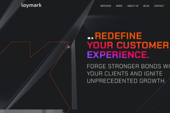
Our new website an example of our work
Continual improvement isn’t just a phrase for us; it’s a core principle. When we decided to revamp our website, we dove deep into the latest research and trends in UI/UX design. Our goal? To create a digital space that doesn’t just meet the needs of today but paves the way for the future.
The trends:
The Dark Mode:
2024’s UI trend highlight, Dark Mode, is more than a fashionable choice. It’s a user-centric feature that ensures comfort and accessibility. By introducing a dark theme, we reduce eye strain in low-light conditions, enhancing the digital experience for everyone. Dark Mode isn’t just a trend; it’s our commitment to thoughtful, inclusive design.
Energy Efficiency & Eco-Friendly Design:
Our design philosophy extends to sustainability. We’ve optimized our website to minimize energy consumption, particularly on AMOLED screens, by predominantly using dark colors. Our upcoming «Eco Mode» feature further cements this commitment, offering a data and energy-efficient browsing option.
A Minimalist Approach with Maximum Impact:
Our design is a blend of minimalism and functionality. Clean space and layout make our content more readable and navigation intuitive. Bold typography doesn’t just catch the eye; it makes our website more inclusive, ensuring that key messages stand out.
Visual Engagement and Interactive Dynamics:
High-quality images and graphics aren’t just decorative; they’re narrative tools that enrich the user experience. Coupled with dynamic menus and interactive elements, our website is not just a platform but a journey, engaging users at every click.
Responsive and Adaptive Design:
In a world where devices are as diverse as the people using them, our website’s flexible layout ensures optimal viewing across all screen sizes. This adaptability is a cornerstone of our approach, making digital experiences accessible and enjoyable for everyone.
Content that Communicates:
Our content strategy is direct yet informative, focusing on what we do best: delivering top-notch services and expertise. This clarity in communication not only conveys our message effectively but also establishes us as leaders in our field.
A Palette that Speaks Volumes:
Our color scheme is a thoughtful mix of vibrancy and subtlety, creating a visual language that is both engaging and pleasing to the eye. It reflects the dynamic and innovative spirit of Loymark.
Iterate is part of our DNA:
This is just the beginning. Our website is a living project, continually evolving to embody the latest trends and technologies. Inclusivity is at the heart of our design. We’re taking steps to ensure our website is accessible to all, we will include detailed image descriptions for visually impaired users and an AI-powered chat for immediate customer support. We also want an «eco mode», which is like activating a lighter version that would reduce data and energy consumption when the user activates it. So, stay tuned!
We invite you to experience this digital transformation firsthand. Visit us at Loymark.com in English and Spanish – because we are a bilingual company- and join us as we redefine the boundaries of UI/UX design.
Welcome to the future of digital experience, where innovation, sustainability, and inclusivity converge — welcome to Loymark.

